

Brand Identity for clothing brand, Chromatic Varsity.
A Brand from the Past Made for the Present
As soon as I was approached by the owner of Chromatic Varsity, a fellow MSU student, I was eager to begin working on his brand identity.
The brief immediately caught my attention: a stylish collegiate clothing brand with the nostalgic charm of vintage sportswear. While some design projects can be harder for me to connect with, this one was right up my alley. Two of my hobbies are fashion and collecting vintage trinkets, so this project felt almost like something I would make in my free time.
Built New from the Broken-In
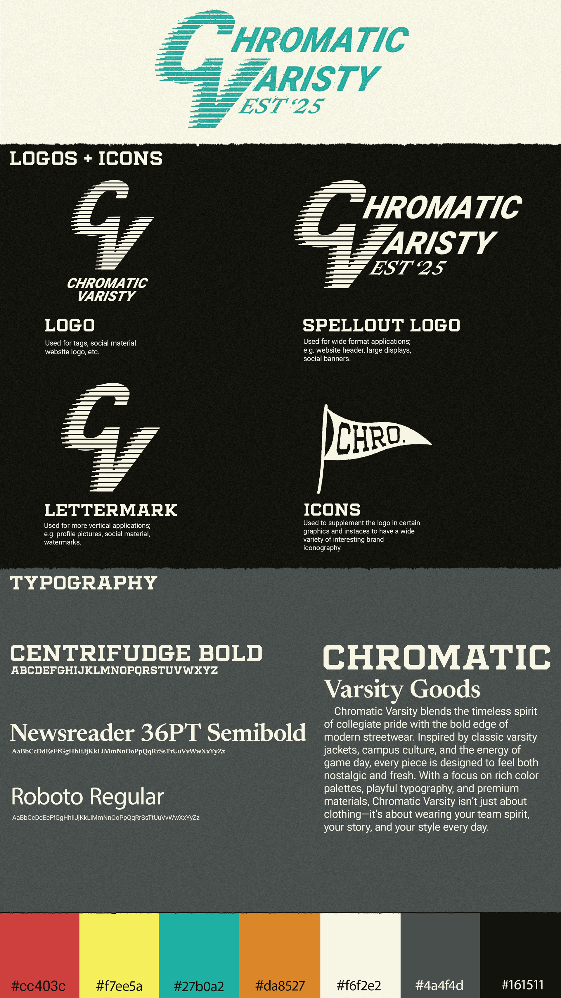
One of the biggest things with this brand is it needed to be versatile, which meant not catering to any school in partiuclar. Therefore, the first thing I did to develop this brand was look at pictures of vintage logos, clothing graphics, and labels.
From there I came up with a few logo sketches. Something that really captured the client's eye was the "speed line" effect. From there I experimented with connecting a C and V in a font similar to vintage brands and applying that effect to make the base logo. From there I made the spellout logo by continuing the text but still having that C and V be the spotlight. Additionally a pennant icon was made in order to have some subtle versatility in branding.
Everything from the colors to the fonts were carefully selected to reference brands from the past, making something fresh, but also feels like it could be from 50-60 years ago.
With Grime and Grit
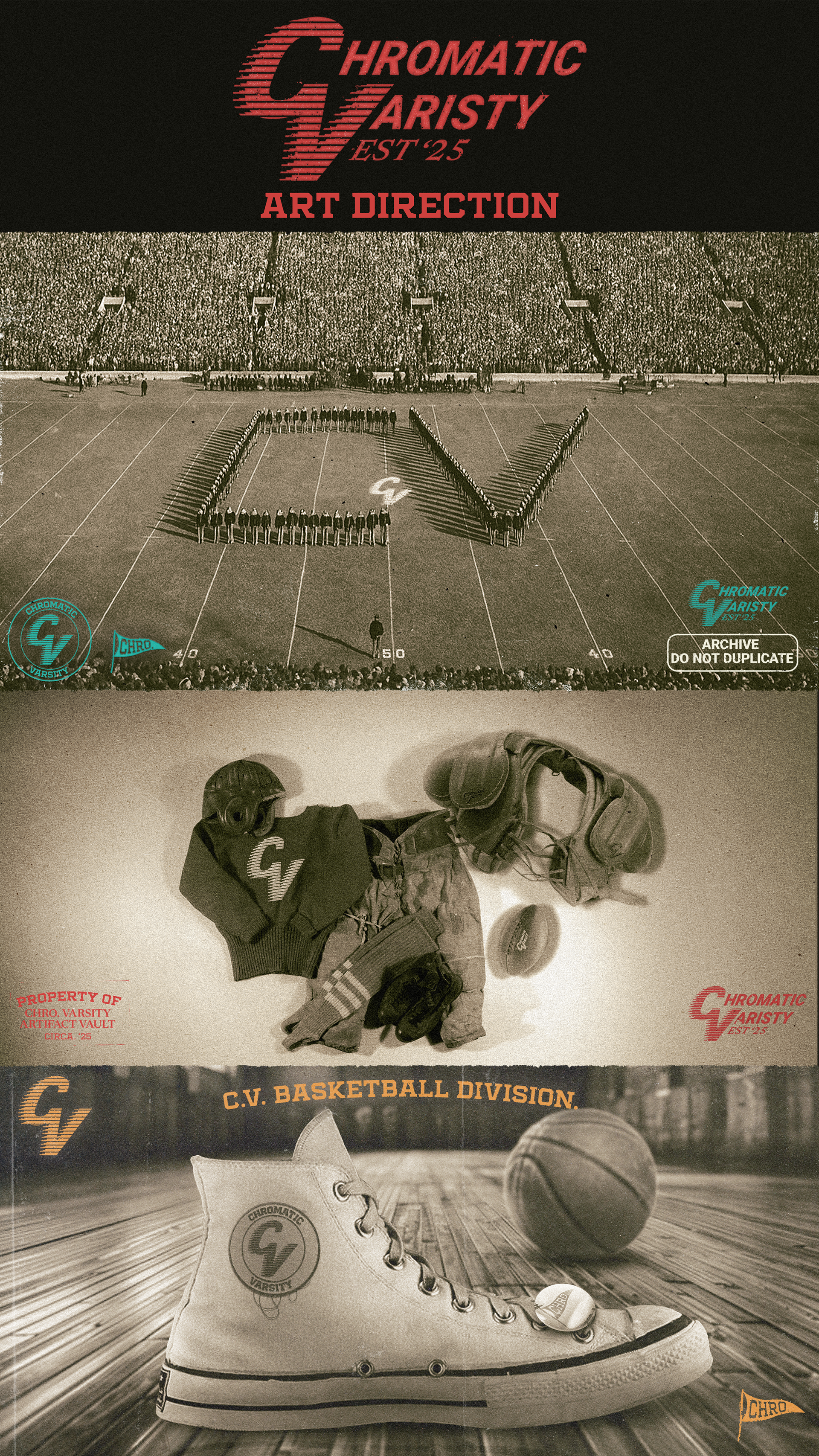
A good brand identity presentation to a client is almost as important as the actual design. If there is no presentation, most clients don’t have the vision to see the brand you’ve created in the way you do. What may be a great design can seem lacking to them.
For this brand identity, I wanted to showcase how the identity could be used through a series of art direction concept images. Each of these frames has elements of the identity tastefully applied in various ways to sell the aesthetic of a brand that feels perfectly aged. It goes further than just adding a logo on top of each image; each scene was curated with details that make the brand seem like a sportswear staple from the past. From the embossed logo on the football shoulder pads to the branded button pin tacked onto the sneaker, each detail reinforces the vibe for the client.
Patina is also important when selling the illusion of something that feels discovered. Loose threads, film specks, and grainy textures all work in harmony with the imagery to make it feel archival. Although this is a very unique way to present a brand, the devil is still in the details when it comes to building any brand identity. The small things and the way a brand is presented, can make a world of difference when working with a client.