

What is Street Teams?
Street Teams are student-run, creative collaborations within ComArtSci at Michigan State University. Interdisciplinary groups of students partner with nonprofit organizations and assist them with media projects. I had the pleasure of working with Team Amethyst to help create a unique deliverable for our non-profit partner, The Poetry Room, a poetry open mic based in Lansing.
Our Deliverable
With our assigned non-profit, we quickly realized that they didn’t really need branding. From the first event we attended, the feeling in the room was electric. People from all walks of life sharing their poems with the utmost emotion, while everyone else cheered and empathized. It was a uniquely human experience. Traditional branding wasn’t what this eclectic space needed; they needed a way to showcase all of the talent. That’s where the idea for a book was formed.
Vibrance for Voices
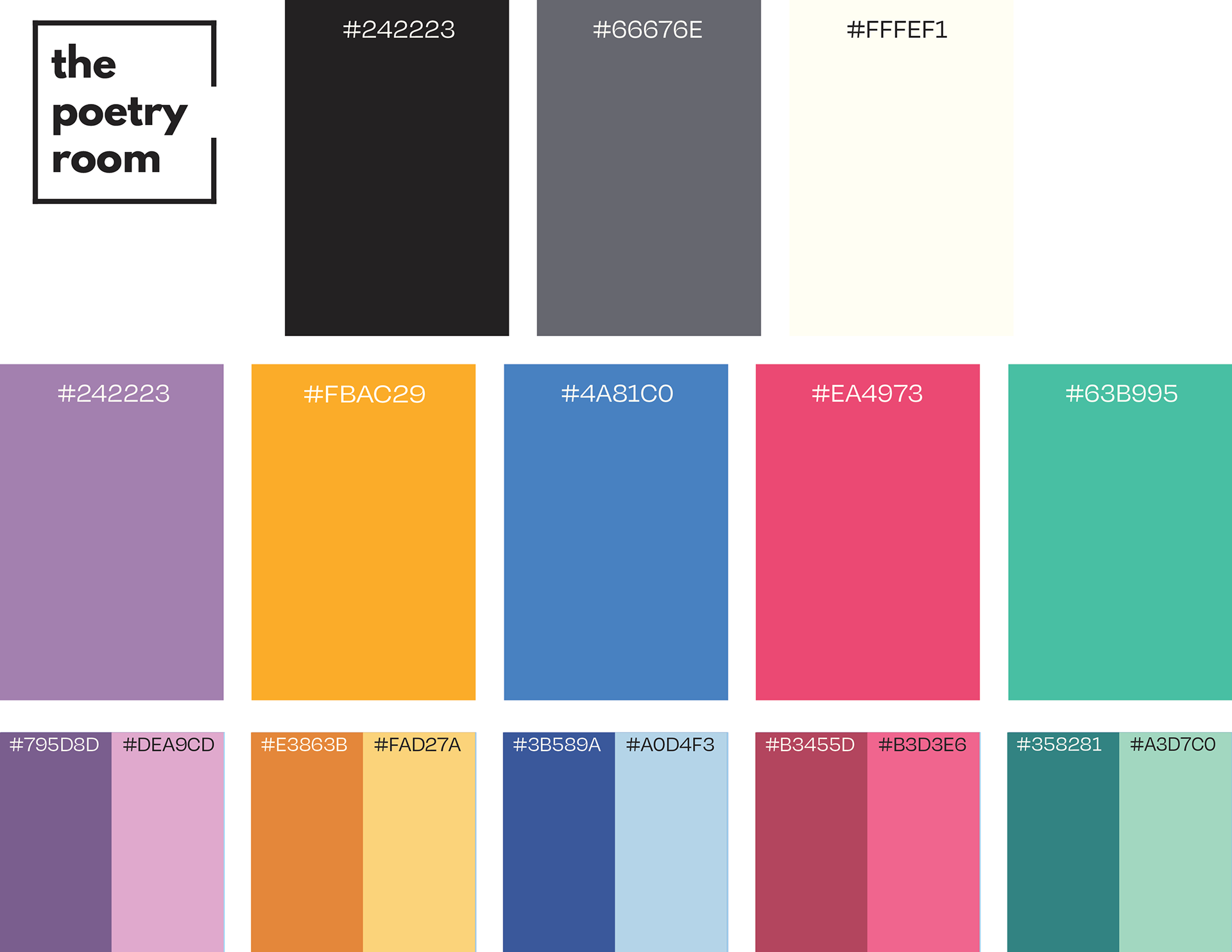
With any visual branding, color is important, and Let’s Go is no different. One of the most vital parts of the book-making process was creating a unique color scheme that fit the tone and enhanced the overall experience. Early on, we knew as designers that this book would be highly visual, but interpreting poetry through graphics can be challenging.
To allow as much freedom as possible in expressing the emotions of the poems, the palette consists of five unique colors, each with a lighter “highlight” tone and a darker “shadow” tone for versatility in illustration. In addition, there is an intentionally selected grayscale. The result is a striking, robust color system that allows illustrations and content to remain playful and unified.
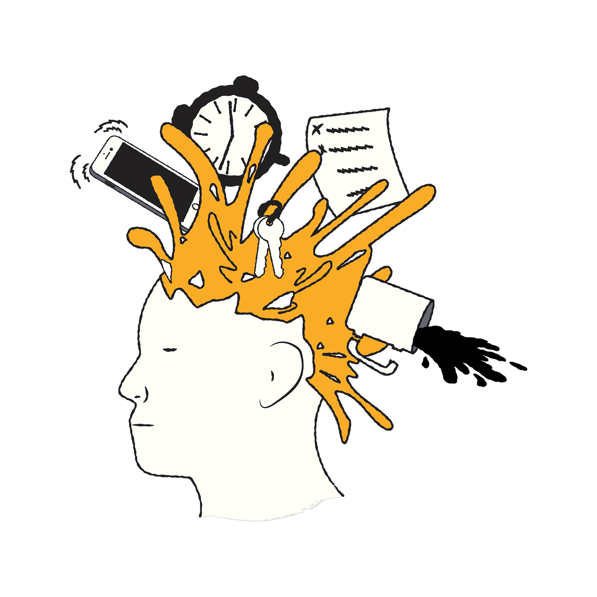
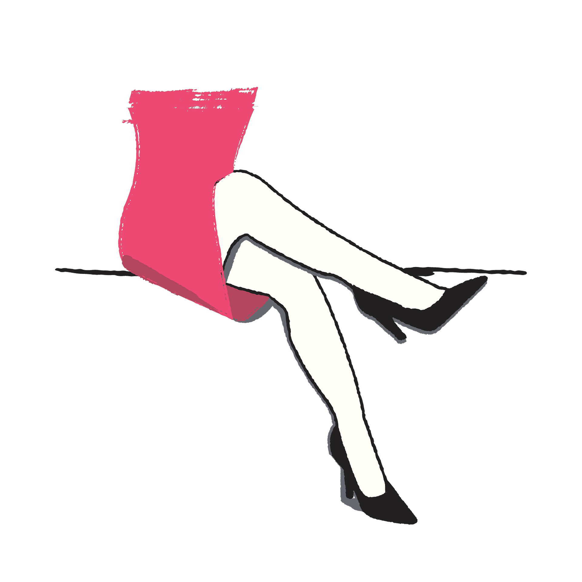

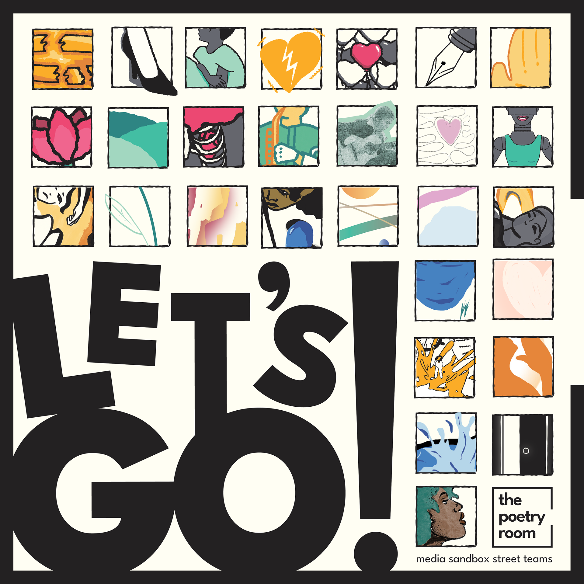
Imperfect Illustrations
For the illustrations, we opted for a more hand-drawn feel, as it felt more human and imperfect, which better suited the emotional tone. Even though we were all artists with different styles, we embraced this. It gave the final product a wider range of illustrative diversity, further reinforcing that human quality.

Put Together Pages
For the page spreads, great attention was given to the placement of every element. The poems are thoughtfully laid out across the pages, sometimes intentionally intertwining with or wrapping around the illustrations. The page break is also carefully considered, as some illustrations make deliberate use of it as a device to add diversity and intrigue to the artwork.