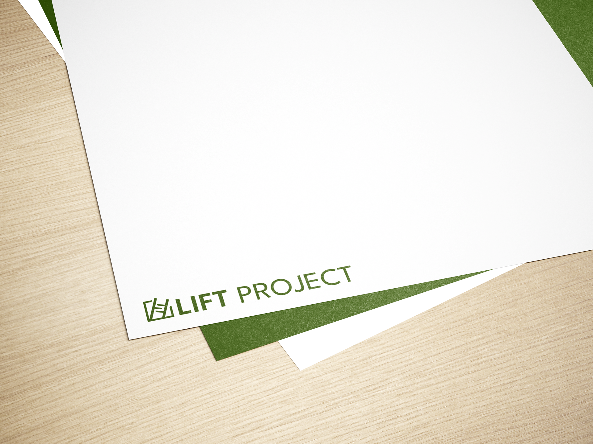
Logo design for research initiative, LIFT Project.
What is LIFT Project?
LIFT Project is a research initiative focused on addressing news disengagement and misinformation by strengthening trust in local journalism. It works with communities and trusted messengers to support more inclusive, community-driven information.
Branding for People, Not Profit
Most branding projects I work on are for companies created to sell a product; however, LIFT Project is not like this at all. This presented a welcome new challenge for me. Designing something for a human-centered initiative required a high level of intentionality and meaning, all while fitting within a specific realm. It was imperative that this logo reflected the goals and function of the LIFT Project- feeling official, but not too corporate or too tacky, as some similar logos can be.
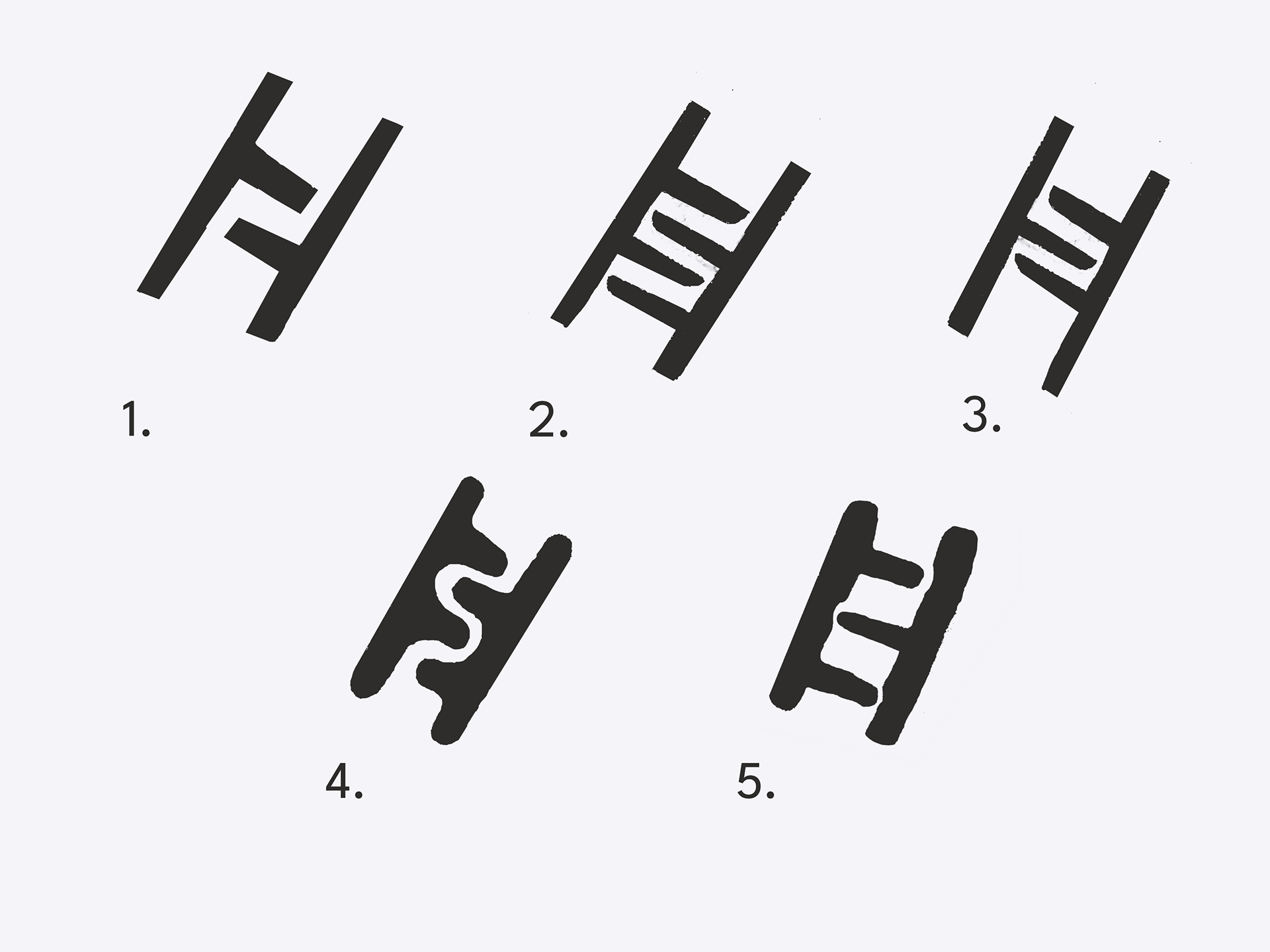
Sketching and Steps
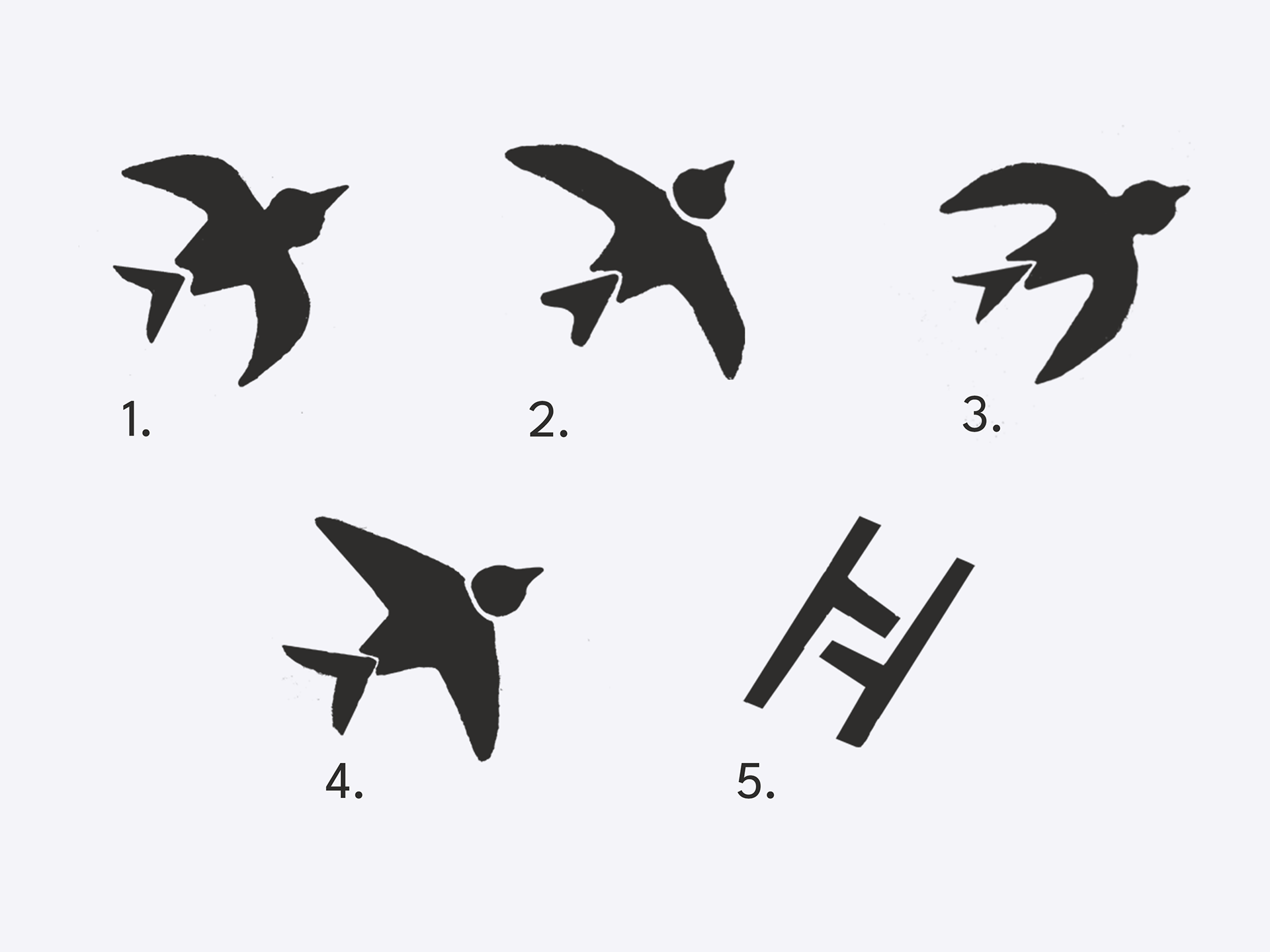
Sketching is very important for getting ideas down as quickly as possible when designing a logo. It is the fastest stage for testing how concepts may work. For this project, I was initially intrigued by birds, as I felt they related to the “LIFT” aspect of the brand and are commonly symbols of hope, among other meanings. I also incorporated arrows to further emphasize the “elevating voices” element of the initiative’s mission.
Another option I explored was a slightly abstract ladder, which caught the client’s eye instantly. When I showed her this concept, I could immediately see her excitement as she envisioned her brand represented with this type of logo. Needless to say, after that feedback session, many ladders were drawn until a final, established direction for the logo emerged.
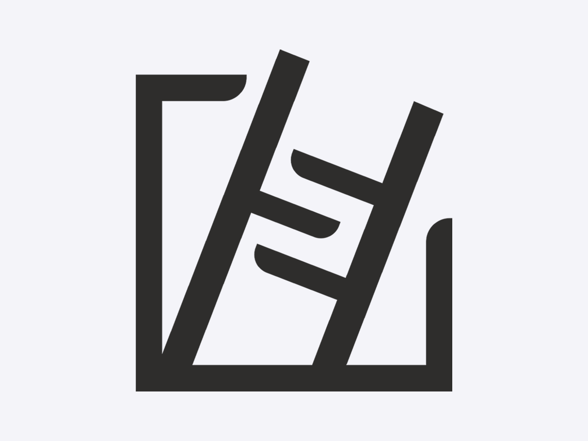
The Final Logo
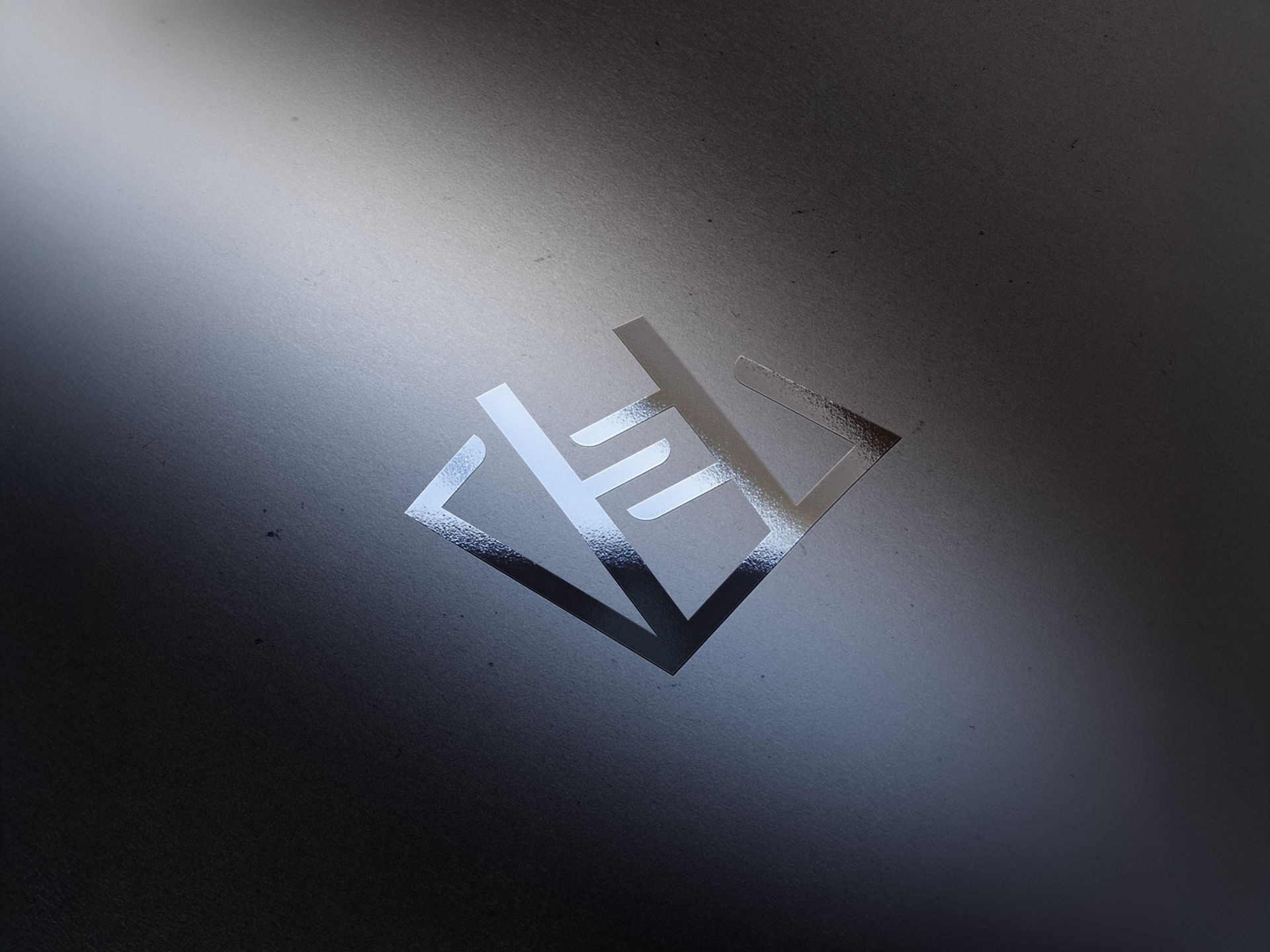
The final logo is mostly the same as one of the initial sketches, with one additional element: the box surrounding it. With just the ladder as the mark, both the client and I felt there was a bit of substance missing. Surprisingly, the box was the client’s suggestion, and it greatly benefited the final logo. It added structure, professionalism, and most importantly meaning to the mark.
This final logo embodies several elements of the brand’s mission, such as the ladder signifying the lifting of voices and its extension beyond the box representing breaking out of conformity and finding new ways to spread news and information. Overall, I am very proud of the final logo and grateful for the opportunity to design something more human-centered, as well as to further develop my ability to collaborate with a client to create something truly compelling for them.